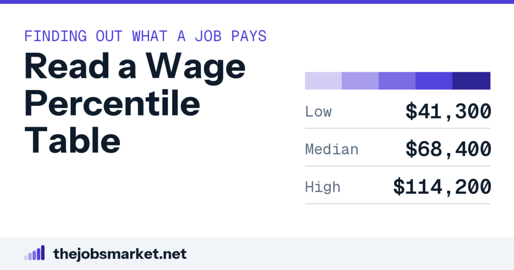
A percentile table shows what workers at each point in the distribution earn: the tenth percentile is what the lowest-paid tenth earn up to, the median is the middle, and the ninetieth is what the top tenth earn above. The ratio between the tenth and ninetieth is the most useful thing in it — a wide ratio means progression happens inside the title, and a narrow one means the way up is changing occupation.
What each number is
A percentile table for an occupation reports five figures, and each answers a specific question. The tenth percentile is the level below which the lowest-paid ten percent sit, and the ninetieth is the level above which the highest-paid ten percent sit. The median in the middle is the point where half earn more and half earn less.
The important thing to hold onto is that these describe positions in a distribution rather than stages in a career. The ninetieth percentile is not what you will earn eventually — it is what somebody else is being paid right now, usually somebody in a different specialization, a different metro, or a more senior version of the role entirely. It is a snapshot of other people rather than a forecast of you.
That distinction matters because people read the top of the table as a personal forecast, and it is not one. It is a description of the market as it stands, with everybody in the occupation sorted from lowest to highest earner. Nothing in the table describes movement over time.
The shape matters more than any single figure
Take the five numbers and compute one ratio: the ninetieth divided by the tenth. Across occupations the median of that ratio is around 2.2 times, which gives you a reference point for whether the occupation you are looking at is unusually wide or unusually narrow. That one comparison frames everything else you read there.
That single ratio tells you more about your prospects than the median does. It describes how much room exists between the bottom and the top of the same job title, which is the space any progression within the occupation has to happen inside. Without room there is nothing for progression to move through.
Everything else in the table follows from the shape. A high median in a narrow occupation and the same median in a wide one imply very different careers, even though the headline number is identical. The median alone cannot distinguish those two situations.
What a wide ratio is telling you
A wide ratio means the title covers a large range of actual work and pay, and progression happens inside it. Personal financial advisors run about 7.1 times, from roughly $50,190 at the tenth percentile to $357,020 at the ninetieth. Chief executives run about 6.7 times, and several physician categories are similar.
In those occupations, staying in the same job title and moving up the distribution is a real career path. The variation is driven by book of business, specialization, employer type and location rather than by changing occupation, so the way to earn more is to become a different kind of practitioner rather than to leave the occupation entirely. That is a genuinely different career strategy from the usual one.
A narrow ratio says the opposite and says it clearly. Farmworkers run about 1.39 times, from $32,900 to $45,690, and bank tellers about 1.45. In those occupations the top of the distribution is close enough to the bottom that no amount of progression within the title changes very much, and the way up is a different occupation altogether.
That is the single most decision-relevant thing a percentile table can tell you, and it takes one division to extract from the table. Five numbers, one calculation, and one genuinely clear answer.
Where you actually sit
Find your own salary in the table and note the percentile band you fall into, then treat that as a question rather than a verdict. Somebody at the twenty-fifth percentile in a wide occupation has enormous headroom inside the title; somebody at the twenty-fifth in a narrow one has very little room at all. The same percentile implies entirely different prospects ahead.
The comparison only works if the table matches your situation. Use your metropolitan area rather than the national table where one is available, because metro variation across occupations runs around 2.3 times and a national figure can be describing a completely different market from your own. Metro tables exist for most occupations and are worth finding.
Check the occupation code too. Standardized occupational categories are coarser than job titles, and a code covering several levels of seniority will show a wide spread for reasons that have nothing to do with progression at all. Check what the code actually covers before reading the spread.
The three things the table hides
The first is composition. A wide spread can mean one job with a lot of internal progression, or it can mean the code is covering two or three distinct jobs. The table cannot tell you which, and the answer changes what the spread means for you entirely.
The second is everything beyond base wages. Most published wage tables report wages rather than total compensation, so bonus, commission, equity and employer contributions sit outside them. In occupations where variable pay is a large share, the real spread is wider than the table shows.
The third is the sample behind any specific cut. A metro-level figure for an occupation with a few hundred local workers can be moved substantially by one employer, which is how implausible comparisons get published. Where a number looks extraordinary, the sample size is usually the explanation.
Reading an offer against the table
An offer at the median for your occupation and metro is a market-rate offer, which is a useful thing to establish before deciding how to feel about it. Below the twenty-fifth percentile is worth a specific question about how the figure was set, particularly if you match the stated requirements closely. That question is reasonable and it is frequently productive.
Above the seventy-fifth is worth understanding rather than simply enjoying. It usually reflects either a genuinely more senior scope than the title implies, an employer paying above market to attract candidates, or a specialization premium — and knowing which one it is tells you what your next move should look like. Each explanation implies a different strategy from here.
Use percentiles rather than the median in any negotiation. “The range for this occupation in this metro runs from X at the twenty-fifth to Y at the seventy-fifth, and I’m targeting the upper half based on Z” is a checkable statement about the market, which is what makes a benchmark persuasive rather than merely asserted at somebody. An employer can verify it in about a minute.
One number is never enough
The failure mode this whole article is aimed at is quoting a single figure — usually the median, occasionally the mean — and treating it as the answer. A single point tells you nothing about the room above it or the risk below it.
The mean is worse than the median for this purpose in skewed occupations. Mean sits around six percent above median at the midpoint across large occupations, and in the extreme cases it is far more: personal financial advisors show a median of $105,070 against a mean of $156,670. Quote the mean there and you have described almost nobody.
So read the table as a shape rather than a number. Where is the middle, how far is the top from the bottom, and where do you sit in that range — three readings from five figures, and together they answer a question that no single number can.
Common questions
What does each percentile mean?
The tenth is the level the lowest-paid ten percent sit below, the ninetieth the level the highest-paid ten percent sit above, and the median is where half earn more and half less.
Is the ninetieth percentile my eventual salary?
No. It describes what somebody else earns right now — usually in a different specialization, metro or seniority level — rather than a stage you progress through.
What is the single most useful figure?
The ninetieth divided by the tenth. Across occupations the median ratio is around 2.2 times, which gives you a reference for whether yours is unusually wide or narrow.
What does a wide ratio mean?
That progression happens inside the title. Personal financial advisors run about 7.1 times, from roughly $50,190 to $357,020, driven by specialization and client base rather than changing occupation.
What does a narrow ratio mean?
That the way up is a different occupation. Farmworkers run about 1.39 times, from $32,900 to $45,690, so progression within the title changes very little.
What does the table hide?
Composition — a wide spread may be two jobs under one code; everything beyond base wages, since bonus and equity sit outside most tables; and the sample size behind any specific cut.
How should I read an offer against it?
Median is market rate. Below the twenty-fifth deserves a question about how it was set. Above the seventy-fifth is worth understanding, since it usually reflects scope, an above-market employer, or a specialization premium.
Why not just quote the median?
Because a single point says nothing about the room above or the risk below. The mean is worse in skewed occupations — advisors show $105,070 median against $156,670 mean.