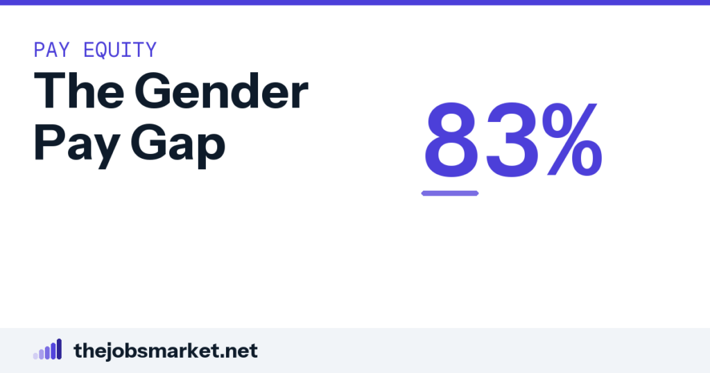
The headline gender pay gap compares the median weekly earnings of all full-time working women against the median for all full-time working men. It is a comparison of two medians across the whole workforce, not a comparison of two people doing the same job. That makes it an accurate description of how earnings are distributed by sex across the economy, and a poor answer to the question of whether any particular employer pays women less for the same work.
What the figure is, precisely
The number most often quoted comes from the Current Population Survey and compares median usual weekly earnings for full-time wage and salary workers. Women’s median sat at 83 percent of men’s in 2024, and the figure has moved within a narrow band of roughly 81 to 84 percent since 2010. Before that it climbed steeply: it was 62 percent in 1979, so the long view shows a large closure followed by a long plateau.
Notice carefully what is actually being compared here. One median is calculated across every full-time working woman in the country and the other across every full-time working man, and then the two are set against each other. Nobody in either group is matched to anybody in the other. The comparison is between two distributions rather than between two people, and that distinction carries almost every misunderstanding attached to this statistic.
It is also worth saying plainly that the figure is carefully produced. This is not a campaigning number or a back-of-envelope estimate. It comes from a large, long-running government survey with published methodology, and the reason it appears everywhere is that it is one of very few measures available consistently over four decades. Criticism of how it gets used is not criticism of how it is made.
What it therefore includes
Because it compares everybody to everybody, the figure includes every difference in how men and women are distributed across the labor market. Occupational sorting is the largest of these: women are concentrated in some fields and men in others, and those fields pay differently. Industry sorting works the same way, as does the distribution across seniority levels within organizations.
It also includes differences in hours among full-time workers, since a full-time week can run from thirty-five hours to sixty and the survey counts anybody above the threshold as full-time. That alone accounts for a measurable share of the difference. And it includes the effects of career interruptions on the earnings trajectory of the people who take them, which in practice is mostly women, with consequences that persist long after the interruption ends.
All of that is inside the 83 percent, which is precisely why the figure is useful for one purpose and misleading for another. If your question is how earnings are distributed by sex across the whole economy, everything above belongs in the answer. If your question is whether a particular employer underpays women in a particular role, none of it does.
What it excludes
Part-time workers are excluded from the headline series, which matters because part-time work is disproportionately done by women and is generally paid less per hour. Self-employed people are excluded from the series entirely. So is anybody not working, which means periods out of the labor market appear only indirectly, through their effect on the earnings of people who later return.
The figure also says nothing about total compensation. It is weekly earnings, so bonuses paid annually, equity, and employer retirement contributions sit outside it, and those components are distributed less evenly than base pay in most industries. A gap measured on total compensation would be a different and generally larger number.
Why the source matters more than usual here
Several organizations publish gender pay gap figures and they do not agree with each other. The reason is not carelessness but definition: they measure different populations over different periods. Weekly earnings for full-time workers, annual earnings for full-time year-round workers, and hourly earnings for all workers each produce a different percentage, and all three are defensible on their own terms. The spread between them is wide enough to change what a sentence means.
That is why a figure quoted without its source and population is close to useless. When you meet one, the two questions that settle what it means are which workers were included and over what period earnings were measured. If an article cannot answer both, it does not know what its own number means, and neither will you.
The most common misuse, and how to avoid it
The misuse to watch for runs in both directions. One side quotes 83 percent as though it demonstrated that women are paid 17 percent less for identical work, which the figure does not show and was never constructed to show. The other side points out that it is not a like-for-like comparison and concludes that it therefore shows nothing, which is equally wrong — a workforce where sorting produces a persistent 17-point earnings difference is describing something real about how careers develop.
The honest position is that the unadjusted figure measures an outcome and says nothing whatever about the mechanism. Whether the sorting behind it reflects free choices, constrained ones, or discrimination in hiring and promotion is a separate question requiring separate evidence. The headline number cannot settle it in either direction, and anybody using it to do so is asking it to carry weight it was not built for.
Why the plateau since 2010 is the interesting part
The long-run picture has two distinct phases and almost all the public argument concerns only the second. Between 1979 and roughly 2010 the ratio climbed from 62 percent into the low eighties, which is a very large movement over three decades. Since then it has moved within a band of a few points and gone nowhere in particular.
That shape matters because the two phases probably have different explanations. The first coincided with large changes in women’s educational attainment and entry into occupations that had been effectively closed, and those are one-time transitions rather than continuing processes — once a field is open, it cannot be opened again. The plateau suggests the remaining difference is produced by something the first wave of change did not touch.
Which is why the age breakdown and the occupational sorting data have become more informative than the headline series itself. A number that has not moved in fifteen years tells you very little about what is happening; the composition underneath it tells you a great deal, and it is where the useful reading now happens.
How to use it honestly
Treat it as a fact about the workforce rather than a fact about any employer, including your own. It tells you something true and worth knowing about how earnings are distributed by sex across an entire economy. That is a large claim and a genuinely useful one, and it is also the limit of what the figure supports.
For a question about your own pay, you need a different instrument entirely. The percentile range for your occupation in your metropolitan area tells you where the market sits, a posted range for your role tells you where an employer sits, and a comparison against a specific colleague doing substantially similar work is what an equal pay claim actually rests on. Each of those is covered elsewhere in this section, and none of them is the 83 percent.
This is general information about what the statistic measures rather than legal advice about your pay. If you believe you are being paid less than a comparator for substantially similar work, that is a specific legal question with its own tests and time limits, and an employment lawyer or your state agency can tell you where you stand.
Common questions
What does the 83 percent figure compare?
Median usual weekly earnings for all full-time working women against the median for all full-time working men. Two medians across the whole workforce, with nobody matched to anybody.
Has it changed over time?
It was 62 percent in 1979 and has sat in a narrow band of roughly 81 to 84 percent since 2010 — a large closure followed by a long plateau.
What is included in the gap?
Every difference in how men and women are distributed across the labor market: occupational and industry sorting, seniority levels, hours variation among full-time workers, and the effect of career interruptions.
What is excluded?
Part-time workers, the self-employed, anybody not working, and everything beyond weekly earnings — so annual bonuses, equity and retirement contributions sit outside it.
Why do published figures differ?
Because they measure different populations. Weekly earnings for full-time workers, annual earnings for full-time year-round workers, and hourly earnings for all workers give three different percentages, all defensible.
Does it prove unequal pay for equal work?
No, and it was not built to. It measures an outcome across a workforce and says nothing about the mechanism behind it.
Does that mean it shows nothing?
Also no. A workforce where sorting produces a persistent 17-point earnings difference is describing something real about how careers develop.
What should I use for my own pay?
Percentile ranges for your occupation and metro for the market, a posted range for the employer, and a comparison with a specific colleague doing substantially similar work for a legal claim.